Think about how often you use your smartphone throughout the day. Whether searching for a product, reading reviews, booking appointments, or contacting a business, mobile devices have become the primary way people interact with the internet.
For businesses, this shift has created a new reality: websites must be built for mobile users first.
Many companies still design websites primarily for desktop screens and then attempt to adapt them for mobile devices. Unfortunately, this often creates poor user experiences, lower search rankings, and missed business opportunities.
Mobile-first design is no longer a trend—it’s a business requirement. Companies that prioritize mobile experiences are better positioned to attract visitors, improve engagement, and generate more leads.
What Is Mobile-First Design?
Quick Answer
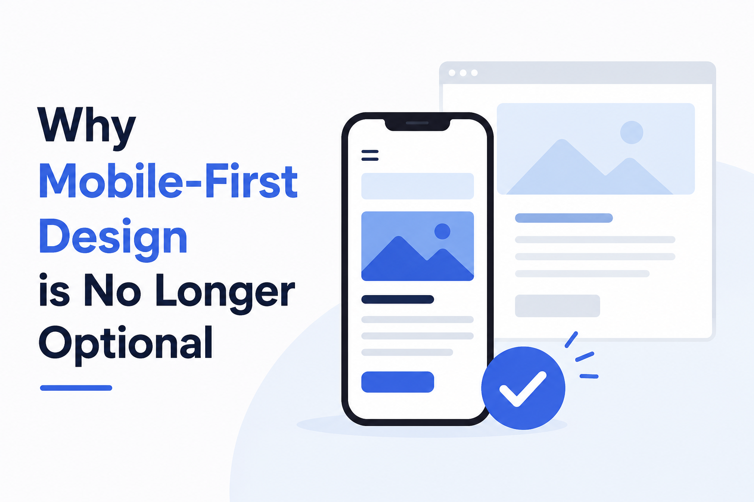
Mobile-first design is a website development approach where the website is designed for smartphones and smaller screens first, then expanded for larger devices such as tablets and desktops.
Instead of treating mobile users as an afterthought, businesses prioritize the mobile experience Faster loading speeds
- Simple navigation
- Easy readability
- Responsive layouts
- Touch-friendly interactions
The goal is to provide the best possible experience for users regardless of the device they use.
Why Mobile Usage Continues to Grow
Consumer behavior has changed dramatically over the last decade.
People now use smartphones for:
- Product research
- Online shopping
- Service inquiries
- Local business searches
- Social media engagement
- Appointment bookings
Many industries, including healthcare, education, retail, professional services, and manufacturing, now receive a significant portion of website traffic from mobile devices.
When a visitor encounters a poor mobile experience, they often leave immediately and visit a competitor’s website instead.
Benefits of Mobile-First Design
1. Better User Experience
User experience directly impacts engagement and conversions.
Mobile-first websites provide:
- Faster navigation
- Easier content consumption
- Better readability
- Improved accessibility
Visitors can quickly find information without unnecessary frustration.
2. Higher Conversion Rates
A smooth mobile experience makes it easier for users to:
- Submit inquiries
- Complete purchases
- Request quotes
- Schedule consultations
- Contact your business
Reducing friction often leads to higher conversion rates.
3. Faster Website Performance
Mobile-first websites are typically optimized for speed.
Performance improvements include:
- Compressed images
- Cleaner code
- Faster page loading
- Better responsiveness
Speed plays a significant role in both user satisfaction and search engine rankings.
4. Stronger Brand Perception
Customers often judge a business based on its website experience.
A modern, responsive website creates impressions of:
- Professionalism
- Reliability
- Credibility
- Innovation
Businesses that invest in WordPress Website Design in Thane often prioritize mobile-first strategies to strengthen their online presence.
How Mobile-First Design Impacts SEO
Google’s Mobile-First Indexing
Google primarily evaluates the mobile version of a website when determining search rankings.
This means:
- Mobile performance affects visibility
- Mobile usability impacts rankings
- Poor mobile experiences can reduce organic traffic
Mobile-First Design Supports SEO By:
- Improving page speed
- Reducing bounce rates
- Enhancing user engagement
- Supporting responsive design
- Improving accessibility
Businesses working with an experienced SEO Company in Thane often discover that mobile optimization plays a major role in search performance.
Common Mobile Website Mistakes
Many websites still struggle to meet modern mobile expectations.
Small Text Sizes
Users should not need to zoom to read content.
Slow Loading Pages
Speed remains one of the biggest mobile usability challenges.
Difficult Navigation
Menus should be simple and intuitive.
Tiny Buttons
Buttons and links must be large enough for touch interactions.
Unoptimized Images
Large image files can significantly slow mobile performance.
Pop-Ups That Block Content
Intrusive pop-ups often frustrate visitors and harm user experience.
Best Practices for Mobile-First Websites
Keep Navigation Simple
Visitors should find information quickly.
Prioritize Speed
Optimize images, hosting, and website code.
Use Responsive Design
Your website should adapt automatically to different screen sizes.
Create Mobile-Friendly Forms
Shorter forms often perform better on smartphones.
Focus on Readability
Use clear fonts, proper spacing, and concise content.
Test Across Devices
Regular testing ensures a consistent experience for all users.
Many businesses partner with a trusted Website Design Company in Thane to ensure their websites perform effectively across all devices.
Why Mobile-First Design Supports Business Growth
Mobile-first design is not just about technology—it directly impacts business performance.
Benefits include:
- More website engagement
- Improved lead generation
- Better customer experiences
- Stronger SEO performance
- Increased sales opportunities
- Higher customer satisfaction
As mobile usage continues to grow, businesses that prioritize mobile experiences gain a competitive advantage over those that don’t.
FAQ Section
1. What is mobile-first design?
Mobile-first design is a website design approach that prioritizes mobile devices before adapting the website for larger screens.
2. Why is mobile-first design important?
It improves user experience, search rankings, website performance, and conversion rates.
3. Does mobile-first design affect SEO?
Yes. Google uses mobile-first indexing, making mobile performance a critical ranking factor.
4. Can mobile-first design increase leads?
Yes. Better user experiences often result in more inquiries, bookings, and conversions.
5. Is mobile-first design only important for e-commerce websites?
No. Every business website benefits from a strong mobile experience, regardless of industry.
Your Next Step Forward
Mobile-first design has become essential for businesses that want to remain competitive online. A fast, responsive, and user-friendly mobile experience helps improve customer satisfaction, search visibility, and lead generation.
With 25+ years of experience, proven strategies, and a commitment to measurable results, S2H Digital helps businesses create modern websites that perform across all devices. Whether you need a Website Design Company in Thane, WordPress Website Design in Thane, or SEO Services in Thane, our team is ready to help you build a website that supports long-term growth. Contact us today to discuss your website strategy.from the beginning.